Why I built it
My job search spans multiple platforms, each with its own way of managing applications. Keeping track of everything meant switching between job boards, revisiting listings, and trying to remember where each application stood.
I also found myself repeatedly looking up and copying the same information: contact details, links, preferences and other personal details requested in application forms. I wanted to keep these, along with my CVs and cover letters, in one place, ready to copy and reuse whenever needed.
Existing trackers didn't fit the way I worked, and the alternatives I considered weren't worth the cost for a personal tool. I wanted one place to manage the process, from saving a job posting to preparing for an interview, while reducing the repetitive work around applying.
I decided to build my own tracker, initially as a quick experiment and an opportunity to explore AI-assisted development in Lovable.
Version one, in Lovable
I built the first version in Lovable, using React and Supabase. It quickly became a working full-stack application with user accounts, a database, file uploads and automated emails.
The initial feature set covered the essentials: an overview of application statuses, a profile for reusable personal details, and a place to store CVs and cover letters. Adding a job still required copying information from the original listing.
I used Shovl throughout my job search for over a month. That experience exposed gaps between the initial concept and the way I actually worked, particularly around data entry, prioritising follow-ups and retrieving information before interviews.
At the same time, I found that Lovable was becoming limiting as I wanted more control over the implementation. I started using Claude Code and found it easier to work directly with the code, make targeted changes and troubleshoot issues, with fewer bugs and less friction in my experience.
These two lessons shaped the next iteration: the product needed a better structure, and I wanted a development workflow that gave me greater control over how it was built.


Starting again, design first
Using the first version exposed problems in both its structure and implementation. Rather than keep extending a product that was still exploratory, I decided to rebuild it.
I still use Lovable to explore ideas and layouts, but I wanted direct control over the implementation for this version, so I chose Claude Code.
I designed the product before writing the application. Every screen started as a greyscale wireframe, allowing me to evaluate layout and hierarchy with less influence of visuals. I mapped the different interface states and documented the reasoning behind individual elements directly on the screens.
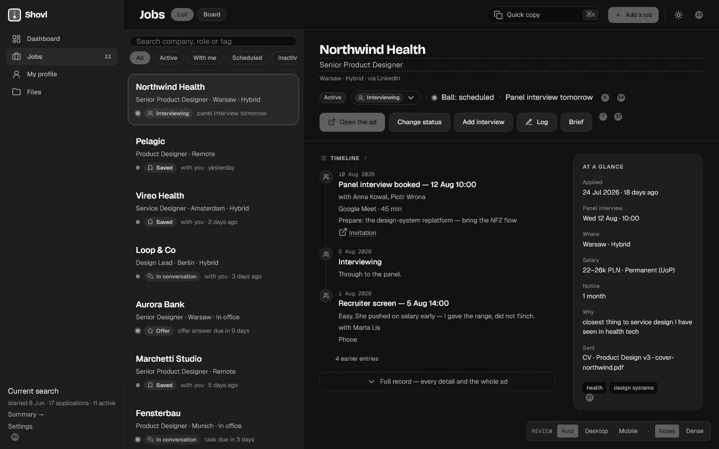
Decisions I made
A month with the first version gave me a clearer picture of the underlying product requirements. These decisions shaped the data model and behaviour before the interface was finalised.
- Saving an application should take little effortOnly the company is required when creating a record. Immediately after applying, I can save the job link and return to the search. The remaining details can be added when they become relevant.
- Recruitment doesn't follow a fixed sequenceRecruitment processes vary in length and structure. A progress bar suggests a consistent sequence of stages, so Shovl uses a status label for the overall state and a timeline for the actual events: interviews, tasks and messages.
- Ownership of the next action is derivedThe next step may belong to the recruiter, to me, or be scheduled for a specific date. Shovl derives this state from the timeline and calendar instead of asking me to maintain another field manually. That distinction also structures the Dashboard.
- Negative outcomes don't dominate the interfaceRejected, withdrawn and unanswered applications use the same neutral visual treatment. Their status remains clear, but the interface doesn't use strong warning colours for routine outcomes in a job search. A hard week doesn't turn the screen red.
- Inactive applications remain recoverableAfter six weeks without activity, an application is marked inactive. The interface makes clear that this is an automatic decision, and the application can be reactivated with one action.
How it looks
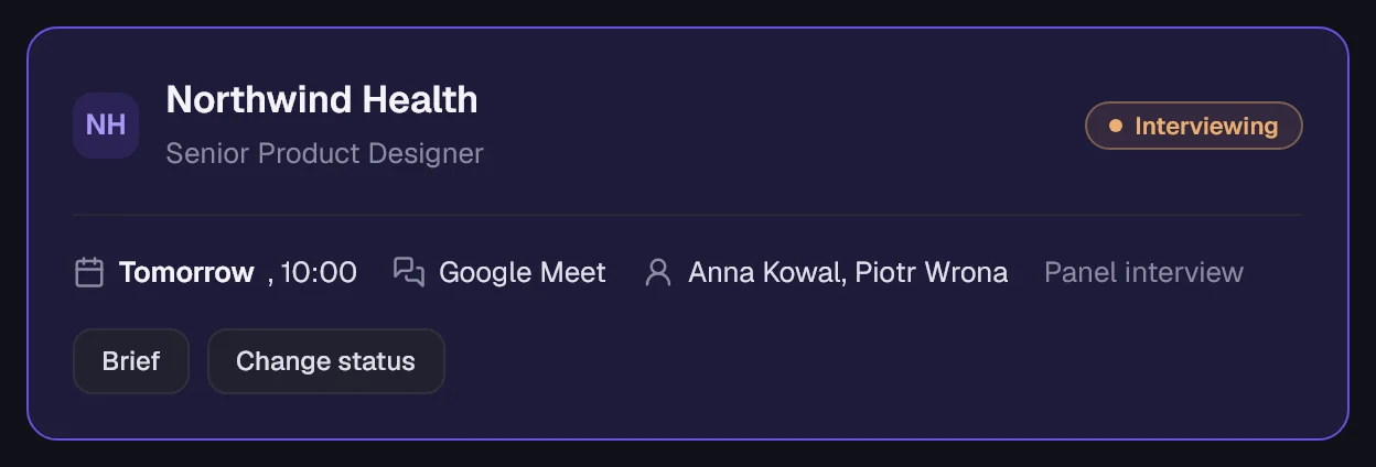
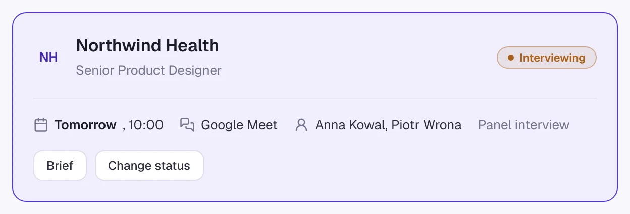
I retained the name, icon and selected colours from the first version, then developed a consistent design system in Claude Design. Indigo anchors the visual identity. A warm clay colour identifies scheduled events and prompts, while the neutral palette has a subtle violet undertone. Bricolage Grotesque is used for headings; Geist handles interface text and numerical information.
The interface is designed dark first, reflecting the conditions in which I usually use it. The light theme uses the same design tokens, keeping the two modes consistent.
Colour reinforces the information hierarchy, but never carries meaning on its own. Every status includes a text label, so the interface remains legible without relying on colour alone.
 Shovl
v2 · dark first
Same name, same icon. Designed in Claude Design, light and dark from one set of tokens.

Bricolage Grotesque for headings · Geist for the interface and anything countable

Every status carries its name. The closing statuses share one quiet neutral.



Redesigned after living with it
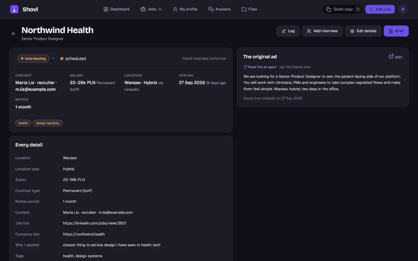
The rebuilt version went live in August. After a week of using it, I reviewed every screen against the actual workflow.
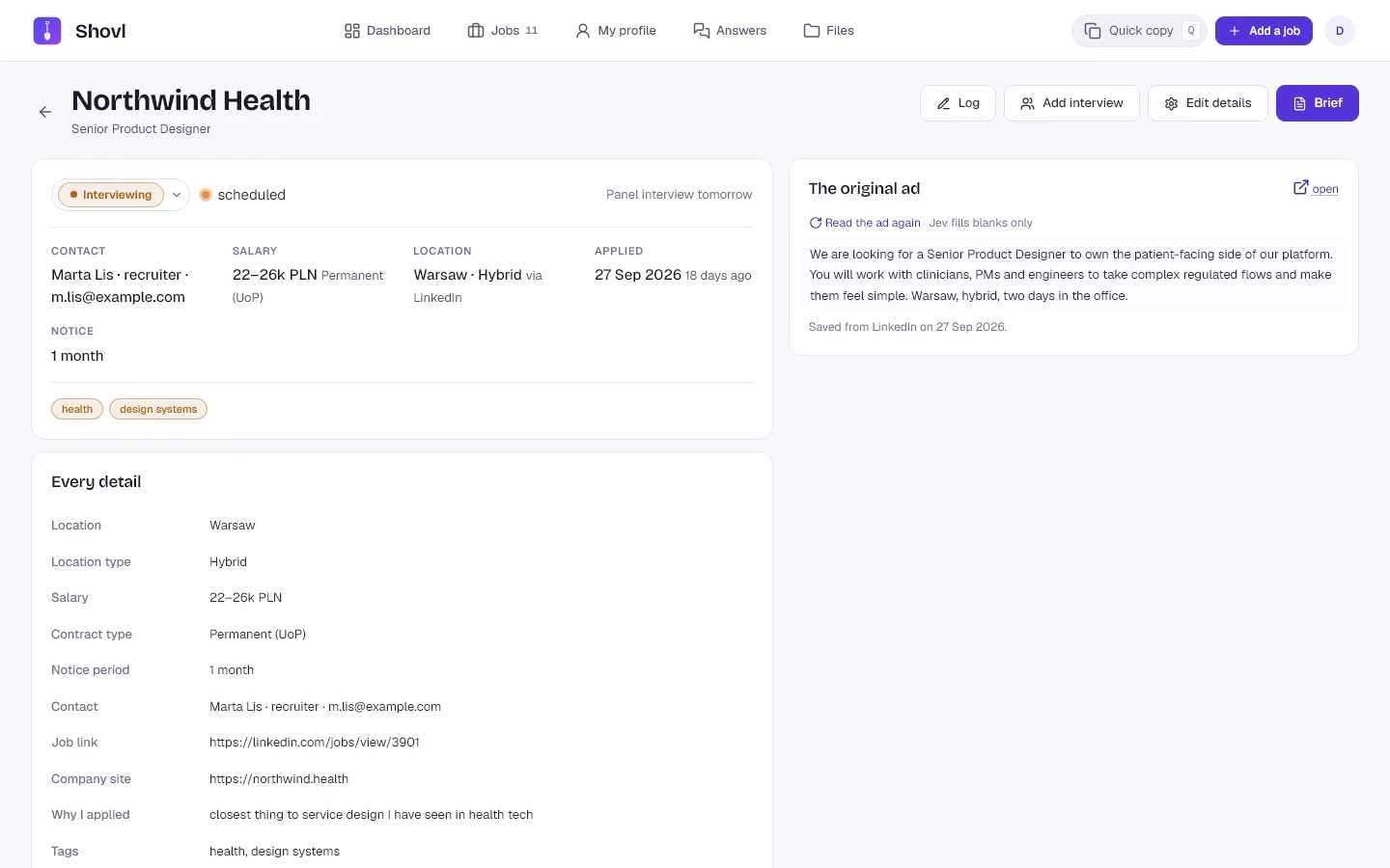
The Dashboard was trying to do too much. Application records were dense, with little hierarchy, and several list patterns presented similar information in different ways. Across the interface, too many elements competed for the same level of attention.
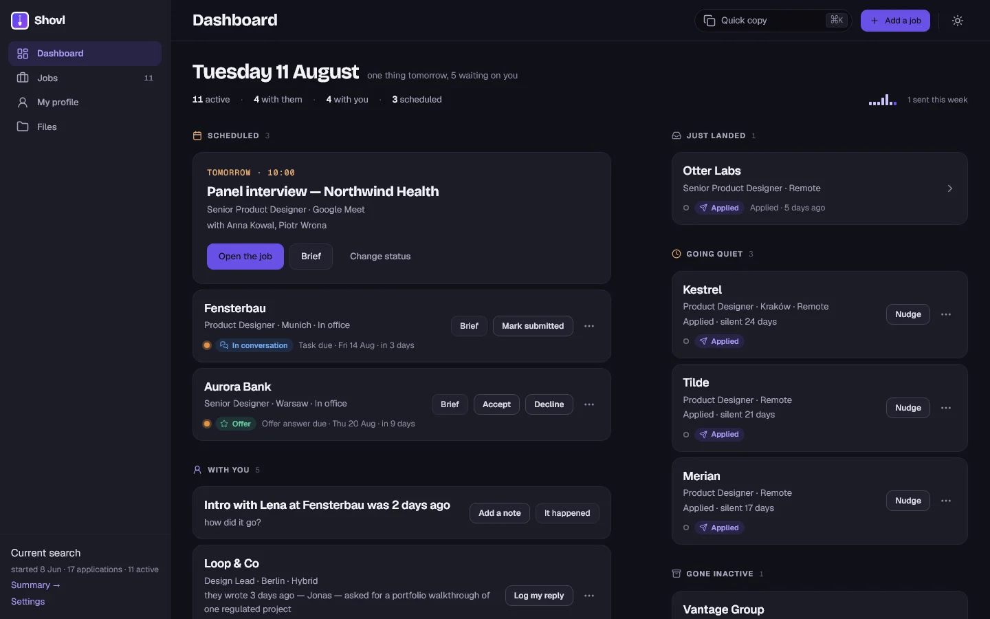
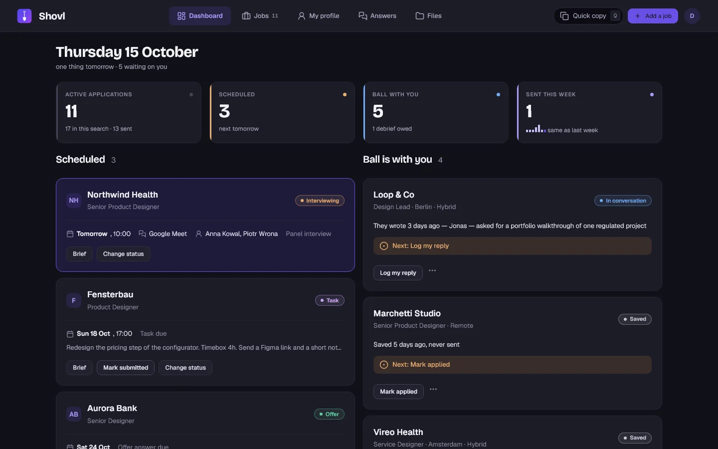
I redesigned the screens individually, consolidating repeated patterns into a shared component layer, replacing the sidebar with a top navigation bar, simplifying the application record, and reorganising the Dashboard around the next action: what was scheduled, what needed my attention, and what was waiting on someone else.
What it does today
Two moments shape the product: capturing a job immediately after applying, and retrieving the right information when a recruiter gets in touch. The main features are designed around those situations.
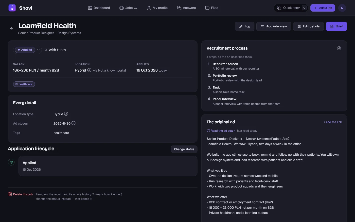
Save a job from its link
Paste a job posting URL to populate the form with information extracted from the listing. If the job board blocks access, the form falls back to pasted posting text.
See who needs to act next
The Dashboard groups applications by what is scheduled, what needs my attention and what has gone quiet.
Find an application during a call
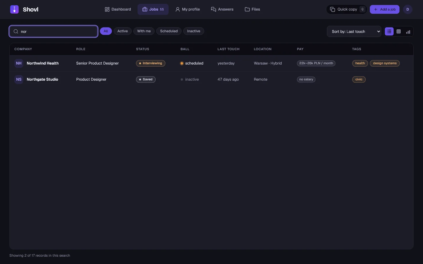
Type a slash followed by a few letters of the company name to open the matching record. The original posting, submitted documents and conversation history are available from there.
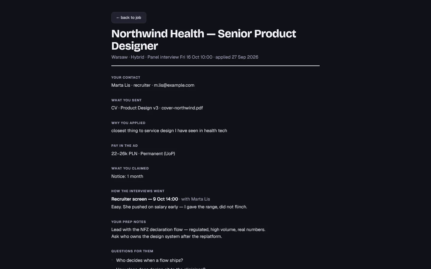
Prepare with the Brief
A single view brings together the information needed before an interview: what I submitted, why I applied, what I said about my experience, notes from previous rounds, and questions to ask.
Reuse personal details
Quick copy retrieves frequently requested profile information using the Q shortcut and a few letters. The selected value is copied to the clipboard without navigating away from the current screen.
Keep separate job searches organised
Completed searches can be archived under a name, leaving a clean workspace for a new search. Profile details and files carry over, while previous applications remain available for reference.
The next step: Jev
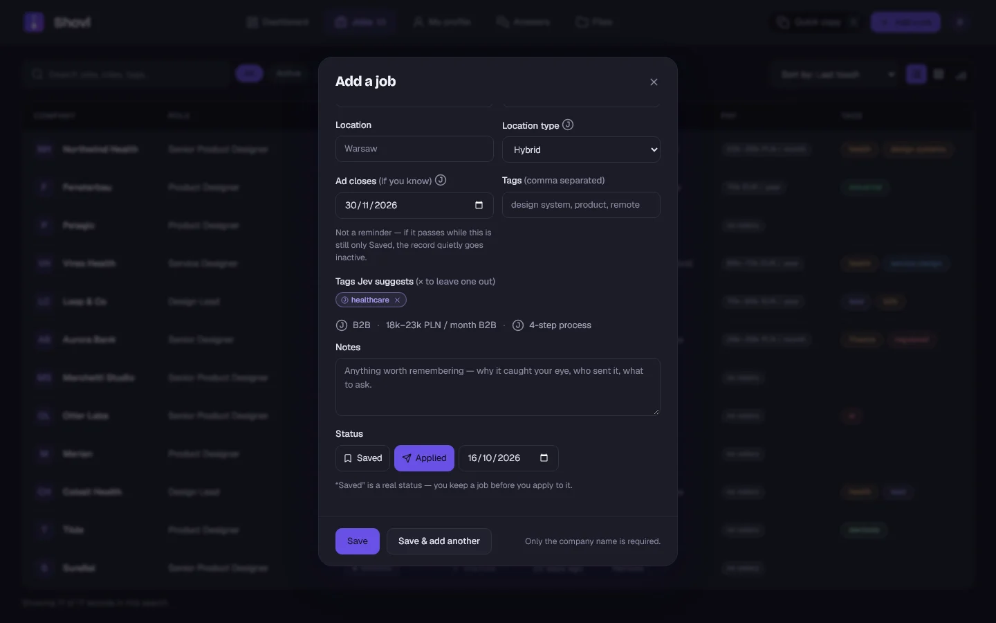
Each iteration has reduced the amount of manual data entry. The first version relied on copying information from a posting. The rebuild can extract information from a job link. Jev takes this further by interpreting the posting and mapping its content to Shovl's structured fields.
Jev identifies likely job titles, fills fields supported by the posting, suggests tags for the company and role, extracts the recruitment stages, and compares the advertised salary with my own rate. Built with TypeSafe, Jev uses a decision model rather than a conversational interface. It answers constrained questions—such as selecting an option from a list or returning a yes/no answer—with an associated confidence score. This makes it suitable for mapping unstructured job descriptions to defined application fields.
Each answer maps to a specific field, and the confidence score determines whether a suggestion is shown. The model is deliberately lightweight: processing a posting costs approximately $0.00006.
- Show only sufficiently confident answersIf confidence falls below the threshold, the suggestion is omitted.
- Keep AI-generated values identifiableA small "J" marker identifies fields populated by Jev until I review or change them.
- Keep the core workflow independentIf Jev is slow or unavailable, its additional suggestions are omitted. Saving an application doesn't depend on the model responding.
- Send only the job postingMy profile, personal notes and written content are not included in the model request.
How it's built
Claude Code handles the implementation; I make the product, design and usability decisions.
The current version uses a deliberately small stack: plain HTML, CSS and JavaScript, with no front-end framework or build step. A Node.js server built with Express handles the application and authentication, while each user's data is stored as a document on a Railway volume.
Development continues incrementally. I make changes, check the behaviour in the browser, and refine the product before shipping each update.
Try the demo
The demo opens the full application with a fictional job search and no sign-up required. You can add an application, change its status and open an interview Brief to explore the main workflows. Nothing is saved.
From a working experiment to a product I use
Built in Lovable and used for a month to identify the product's actual requirements.
Redesigned from the ground up, built with Claude Code, and refined through use.
A job-search tracker I designed, built and continue to develop around my own workflow and needs. It works and I find it very useful.