From idea to live
My niece was heading into her final year of school. Her wellbeing, scouting, sport, school, university applications, home and friends - all competing for space in her head. Some things lived on paper, some in emails, some in memory. The problem wasn't a lack of motivation to be organised. It was losing track of something because it was written down somewhere she wasn't looking.
She needed one calm place to put everything down and know it was there.
The alternatives felt wrong. Adult productivity tools bring the language and pressure of work: projects, priorities, deadlines and overdue states. Teen apps often add streaks, badges and notifications to keep users engaged.
She didn't need another thing asking her to perform. She needed to feel in charge of her life without adding another source of stress.
So I made Patchwork.
A quiet organiser
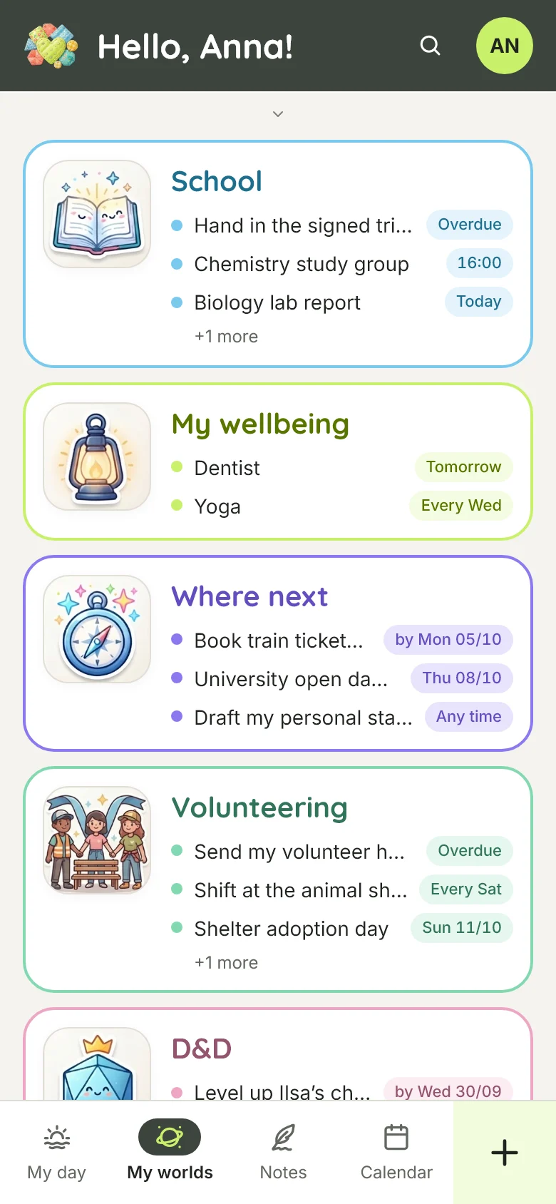
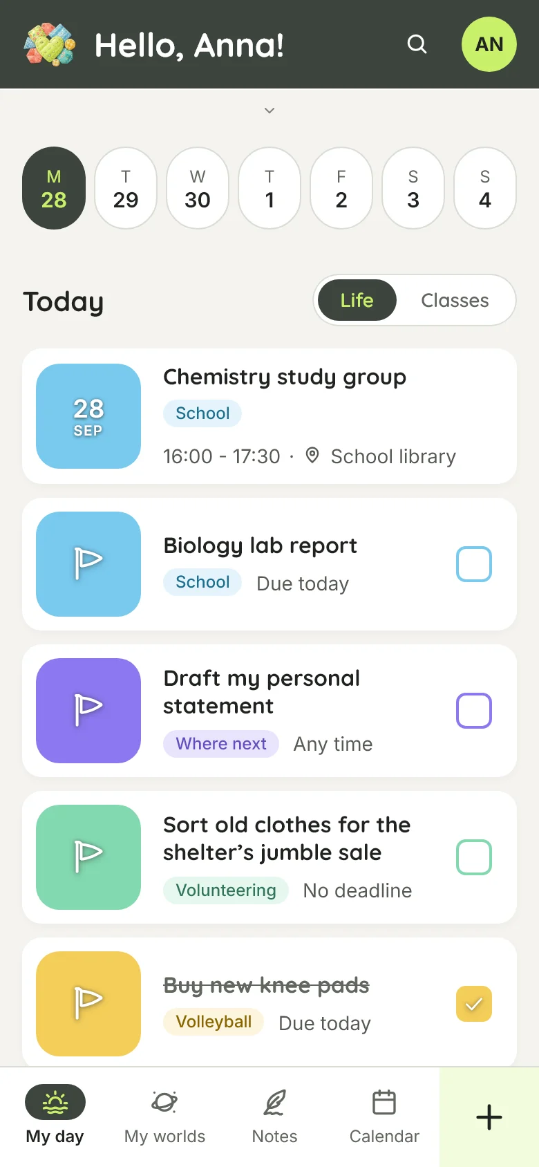
Patchwork brings the different parts of her life into one place as distinct worlds: school, scouting, sport, wellbeing, university applications, home and everything else.
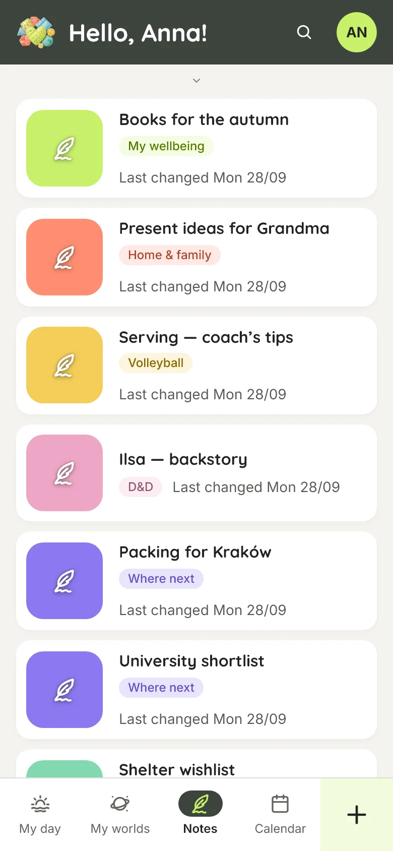
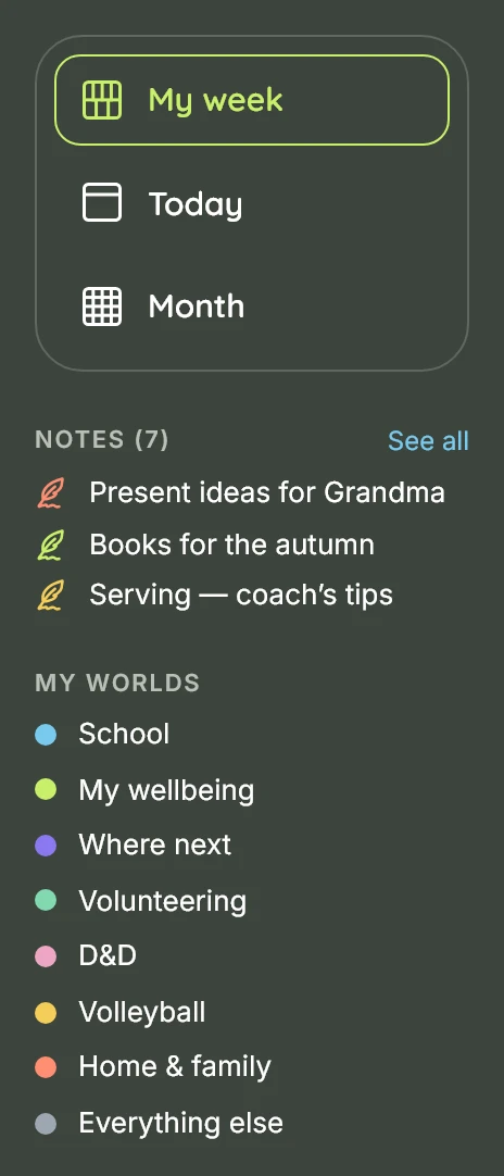
Each world has its own colour and illustration. The language stays ordinary: My worlds. My wellbeing. Everything else.
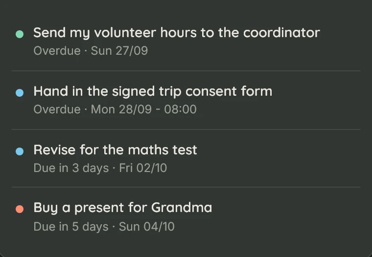
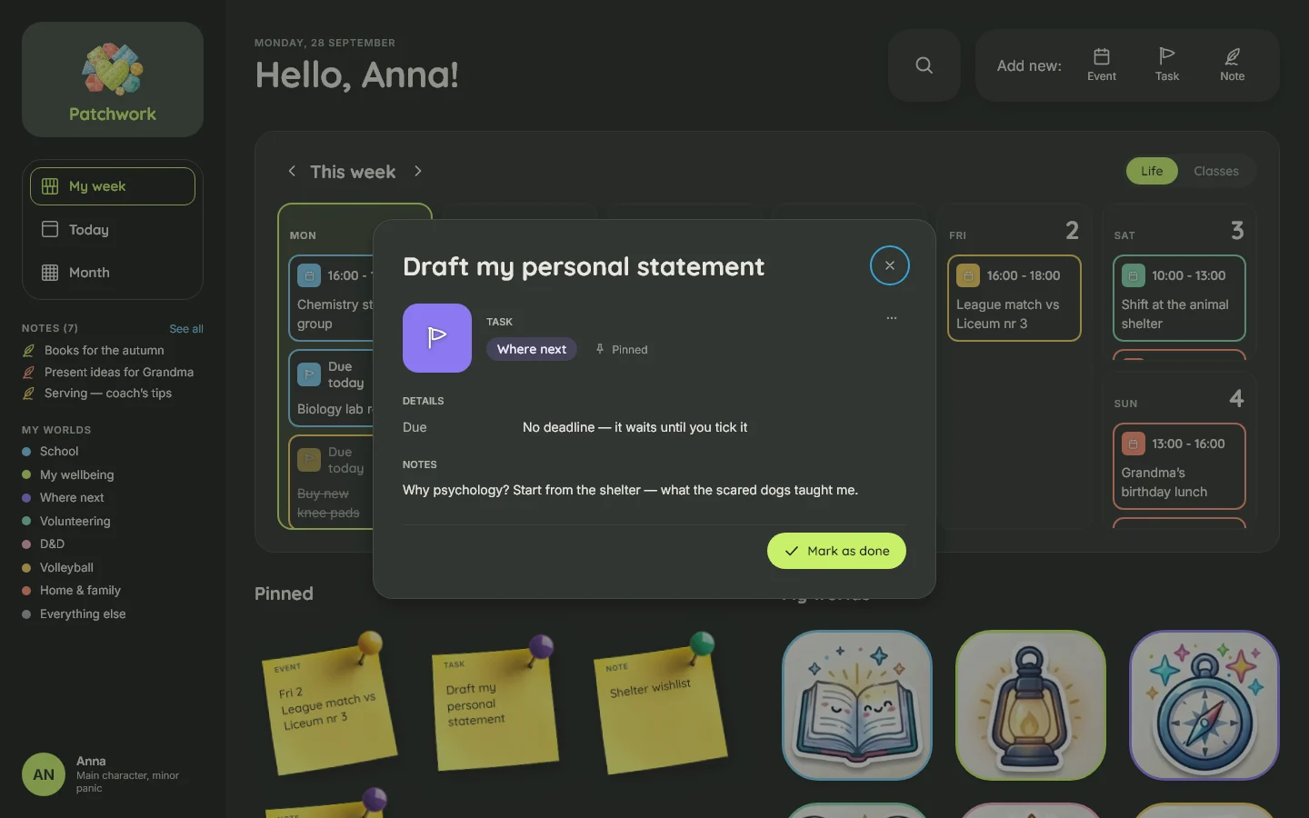
The product doesn't chase her. There are no push notifications, streaks or badges. An overdue task is simply overdue. A task can be skipped without continuing to nag. A pin stays where she put it until she removes it.
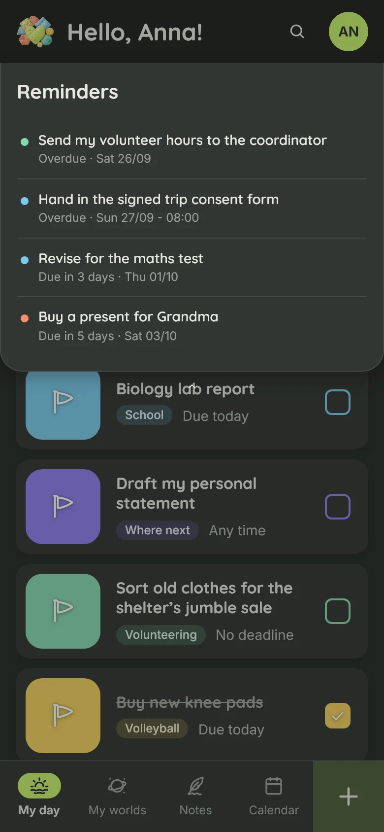
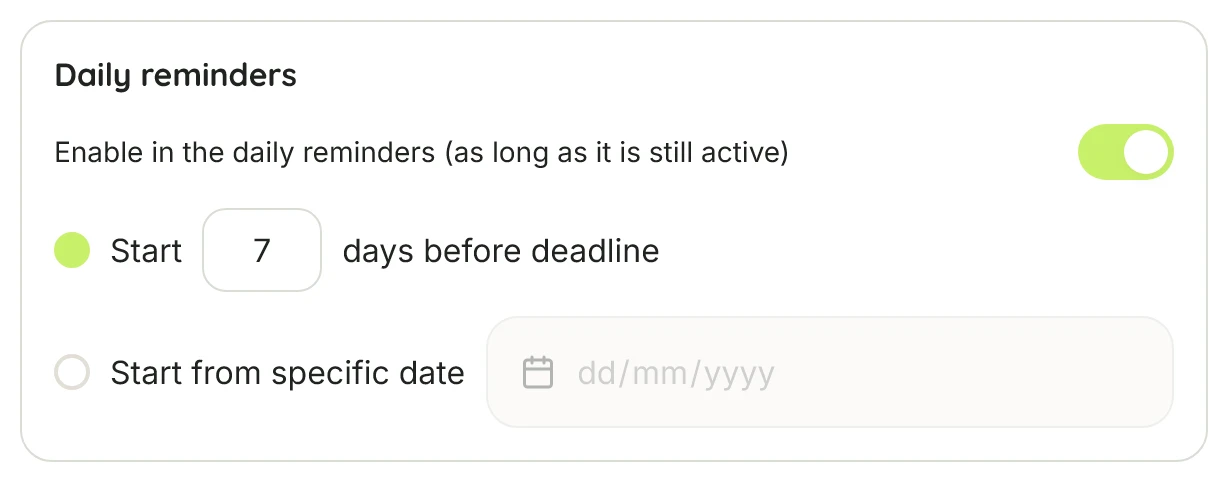
There is no notification machinery, just a list of currently active reminders: visible in the app and, once a day, in the daily email.
These aren't missing features. They are product decisions.
Designed around one real person
Patchwork was designed for my niece first.
Her friends may join later, but the product began with someone real rather than an abstract target audience or persona. I could use the language she actually uses, observe how she thinks about her week, and change things based on real reactions.
It also made it easier to say no.
- No sharing system.
- No calendar import.
- No social layer.
Right now she is the only person using it. That's intentional: it is still early, and I'm testing and refining it with her before opening it up to anyone else.
A visual language and design system
I started in Figma by defining the visual language rather than prototyping the whole application. I established the brand, typography, colour system, main components, tokens and visual assets, which then became the foundation for the implementation in Claude Code.
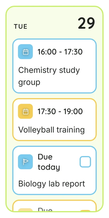
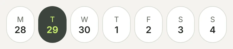
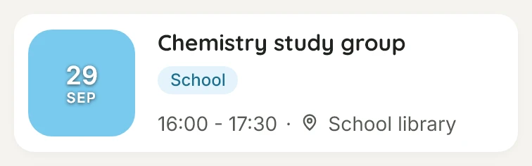
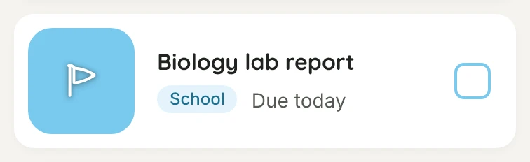
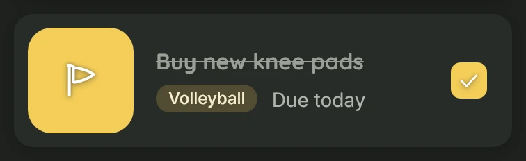
The visual direction is warm and structured: a stone-coloured canvas, white cards, dark green anchors and fourteen accent colours. Colour has a job — each world has its own accent — while hand-drawn illustrations give them character. The colour and typography system meets WCAG contrast requirements in both light and dark modes.
The Figma definition became a working code design system: 35 component modules, 46 primitives, 11 token files and written specifications for behaviour and values. Every component and value was traced back to the design, with anything missing flagged rather than invented.
 Patchwork
Design system · v1
Warm stone, one dark green anchor, white cards. Quicksand for headings, Inter for the rest.
Patchwork
Design system · v1
Warm stone, one dark green anchor, white cards. Quicksand for headings, Inter for the rest.
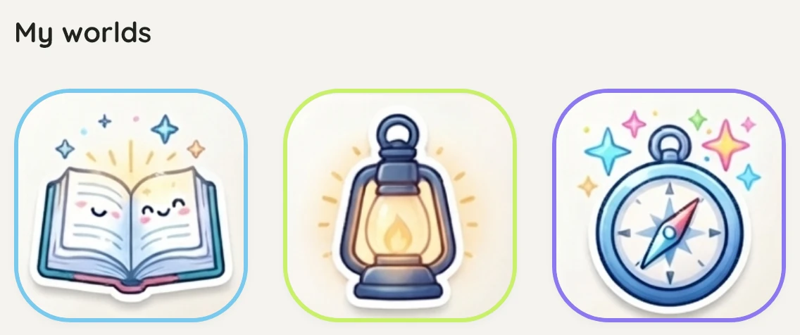
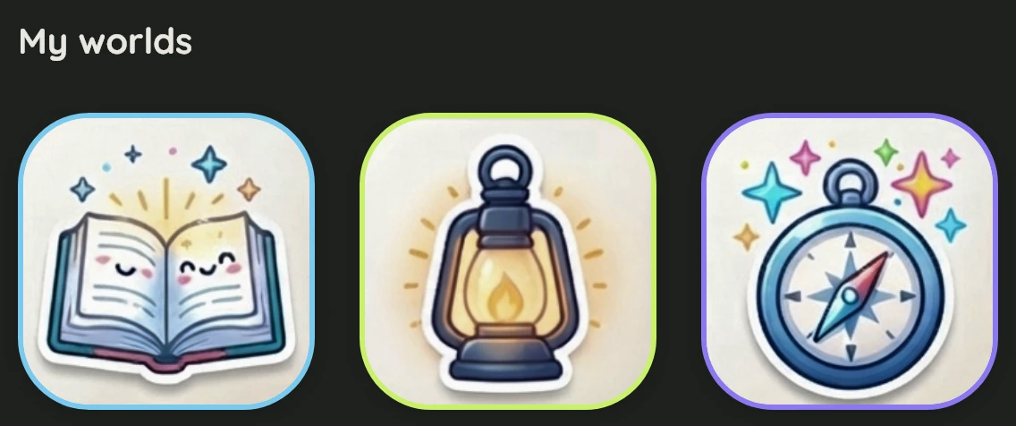
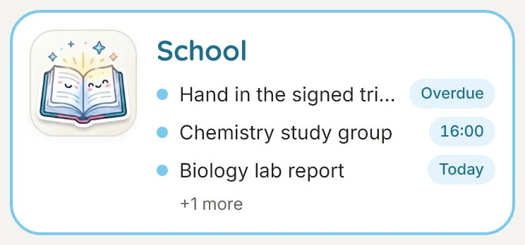
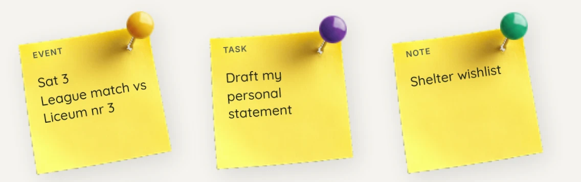
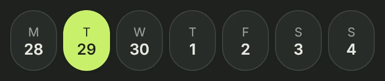
Each world keeps its accent in both themes. Every drawing is redrawn for dark, never dimmed.
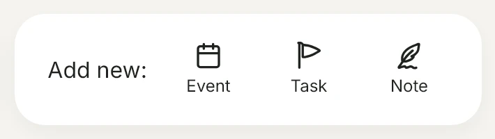
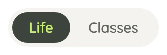
The real components, captured from the live demo — light and dark.



Designed around context
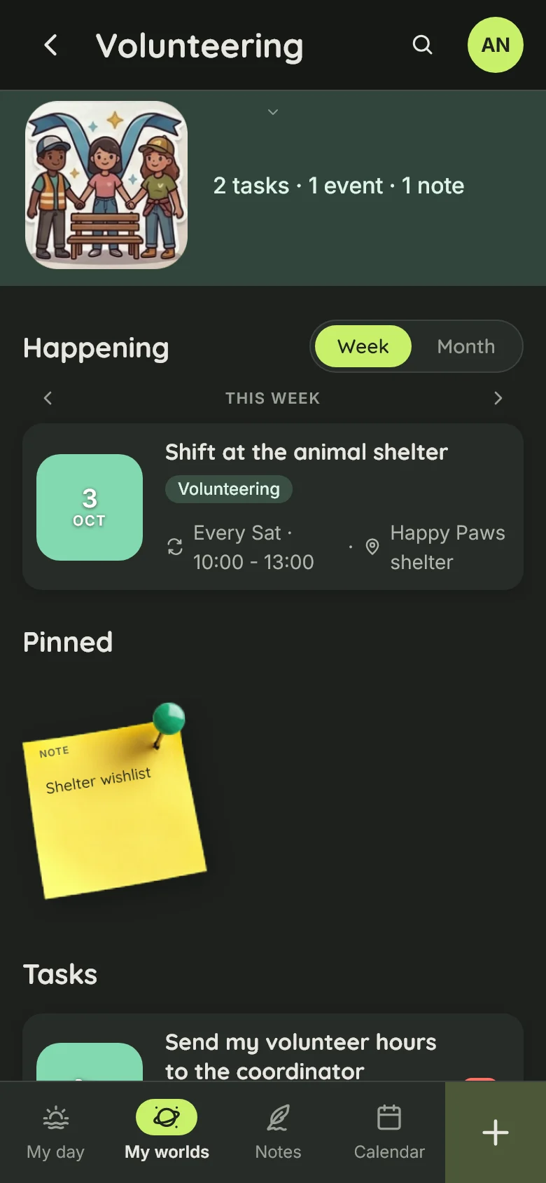
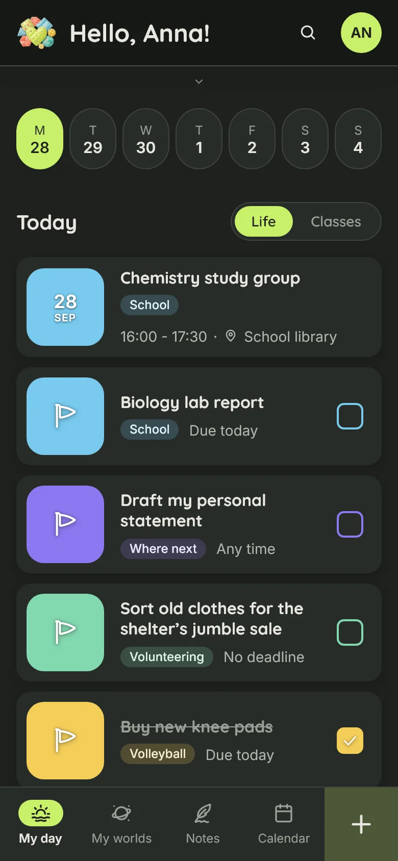
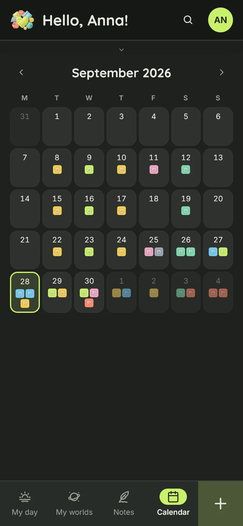
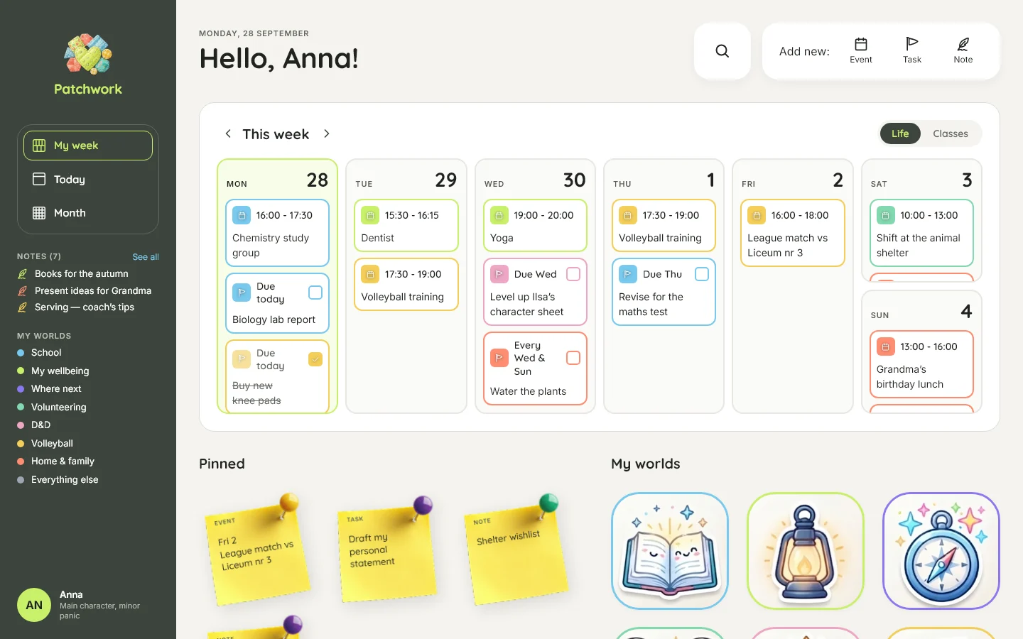
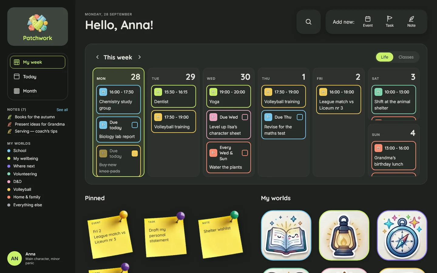
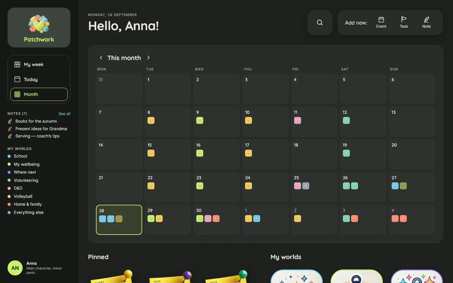
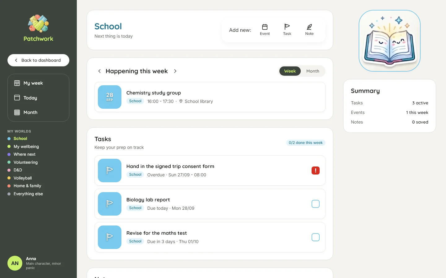
Patchwork is primarily a mobile experience because her phone is with her most of the time. But mobile and desktop aren't the same interface at different widths — they serve different situations.
Mobile is for the day. A quick view of today's workflow, easy access to her worlds and quick actions when she's out and about.
Desktop is for stepping back. At home, with more time and screen space, it becomes a broader planning and life-admin surface: the week at a glance, pinned items, more information visible at once and room for bulk organisation.
Light and dark mode follow the device's system setting automatically. During the day, the light interface is designed to remain comfortable and readable outdoors without harsh contrast. In the evening, the dark interface reduces the amount of screen light when she's at home.
So the two themes and two layouts aren't variations of the same screen. They respond to when, where and how she is using Patchwork.
The same design system holds them together, but the hierarchy changes with the situation.
Designing behaviour, not just screens
Some of the most important decisions aren't visible in screenshots.
- Nothing scoldsOverdue means overdue, not failure.
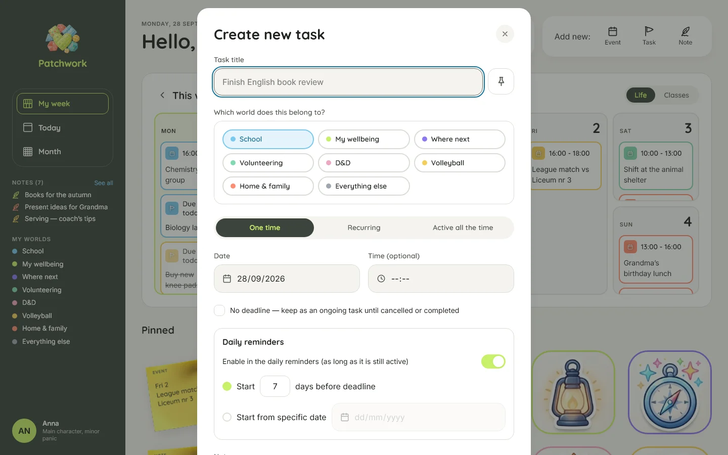
- A task can be skippedIt stops being late without pretending it was completed.
- Postpone is different from editMoving a future deadline is normal; postponing an overdue task is an explicit action.
- Pins stay pinnedThe app never rearranges the user's chosen shelf.
- Lessons are sceneryThe timetable can be viewed, but lessons don't become tasks, reminders or email items.
I wrote these behaviours down before implementation in a plain-English specification. It became the contract between the design and the code.
Architecture shaped by the product
The same thinking carried into the technical architecture.
Task status is derived when read rather than stored by a scheduled process. A task becomes overdue because the current time says it is overdue, not because a background job remembered to update it.
The phone, desktop and daily email use the same server-side reminder logic, so there is one definition of what needs attention.
Backup came before features. Changes are recorded as an append-only event stream in the same transaction, replicated off-site, with restores tested before the first real item was entered.
And because Patchwork contains someone's personal life, administration has a deliberate privacy boundary: the admin interface can show system health and operational counts, but never people's content, and there is no impersonation route.
Built with AI
I owned every product, behavioural and visual decision. The implementation was built with AI coding agents, primarily Claude Code, working directly in the repository.
What made that possible wasn't clever prompting. It was having good design artefacts:
- a behaviour specification written before the features
- a design-system handover traced to Figma
- a builder brief for each implementation session
- a deliberate build order
- continuous review and correction against the original decisions
The agents wrote the code. I directed what the code was supposed to mean.
Built in spare time
Patchwork went from idea to a working product in about three weeks, built in my spare time.
I designed the product, wrote the behavioural and design-system specifications, directed the AI implementation and reviewed each step against the original decisions.
The result is a real application in daily use—not a portfolio prototype. It is live, invite-only and still evolving as I test it with my niece.
The next features and improvements are already specified and will be added as the product grows.
- 118cefcOpen a demo from the sign-in page, on a made-up week that is never kept
- 5d68303Save a one-time task with no deadline, and call it that
- c59f192Name a repeating item once in a world, by its nearest occurrence
- b0b6758Open no day under the phone's calendar until one is tapped
- 77b4d62Let go of "Saving…" when the panel closes
- 7cd6e63Wait for the real worlds: no grey items, a late skeleton, fades that survive reduced motion
- b771ee2Quieten the phone: one-size bar, a reminders list, and the gaps between lessons
- 226811aMake dark mode hold up where it was measured to fail
- decf10fKeep the reminders board to what is late and what has started
Try the demo
Patchwork is invite-only, but a fully working demo is available with seeded example data.
Explore the interface, create, edit, complete and skip items, and see how the different parts of the system work without affecting any real account.
It uses the same application, validation and domain logic as the live version—the only difference is the data.
The design work became the specification, and the specification held all the way to production
Patchwork started with one young person who needed a calmer way to organise a very full life.
It was no longer a design exercise. It was something my niece could open every morning and use to make her life a little more manageable.