Multi-audience IA
A site serving four audiences that share the domain but not the reason to be there. I restructured it around one idea: the main page should become only a router, and the real destinations are rich, per-audience landing pages, with the traffic directed straight to them.
One site, four very different audiences
A contact from Telemedi, newly in an executive role at Centrum CBT, a Polish CBT psychology and psychotherapy organisation, brought me in on contract after an internal audit flagged the website. The company was doing well, but on the strength of its reputation and physical presence, not the site, which was underperforming.
The brief I received was budget-conscious: review the site and propose a redesign that improves navigation and conversion — "just enough to get it to a decent state." The real mess underneath was the structure: it didn't serve the company's very different user types, guided no one toward contact, and content had piled up in the wrong places over the years.
Four destinations, not one compromise
These four audiences want completely different things; no single page serves them all. So I split them apart — a call worked out from the content up, not a guess.
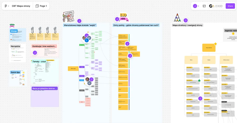
First, the audit
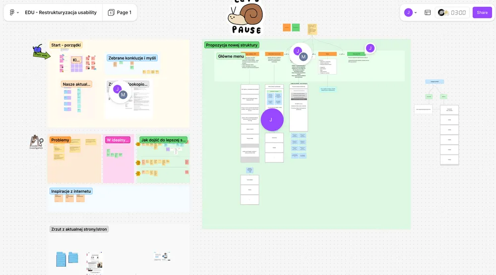
Before a single screen, the real job was the content itself. I went through the site end to end: what was still true, what was stale, what was quietly duplicated. Then I sat with the people responsible for each area to verify it: what's current, what's changing, where each product line is headed. I mapped the whole inventory in FigJam, not wireframes but the raw structure. The routing model fell out of that map; it wasn't guessed at a whiteboard.
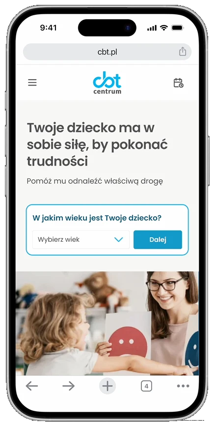
Mobile first, by the data
The tracking told the real story: even though the site was barely usable on mobile, at least 60% of visits already came from phones. So I designed mobile first, in that literal order: mobile wireframes, then mobile hi-fi flows, and only then the desktop views. The mobile experience wasn't a desktop layout negotiated down to fit; it was a proper, easy flow, built for someone reading on the couch.
Less on the main page, on purpose
Barely anyone lands on the homepage anyway — the campaigns that drive real traffic point straight at the branches. So I kept it deliberately lean: brand and trust first, with just enough routing to send the few who do arrive onward. Converting is the branches' work, not the front door's.
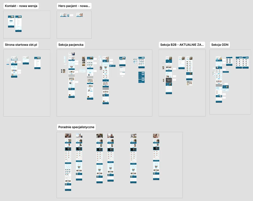
Where the traffic actually lands
Paid, social and SEO send people straight to a branch, never the hub — so each branch has to stand on its own: its own vocabulary, its own proof, its own clear path to contact. It's where the navigation problem and the conversion problem get solved at once.


Four audiences, four reasons to be there
Each branch arrives with its own vocabulary, urgency and reason to be there. I built the personas from conversations across the company, with the people who actually work with each group, and recreated them cleanly here.
Patients
Adults seeking therapy, and minors with their parents, arriving from the clinics. They need reassurance, safety, and an easy way to start.
Professionals & students
Psychotherapy professionals seeking further education, and students taking their first specialisation at a PTTB-qualified school. They need depth, credibility, accreditation.
Businesses
HR and benefits buyers bringing mental-health support to their teams. They need proof, outcomes, and a clear way to bring it in.
Schools
School psychologists, pedagogues and teachers handling children's wellbeing. They need ready-to-run classroom programmes.
A budget brief, taken seriously: structure and usability for conversion, with clean, minimal styling.
It started in FigJam, mapping the structure before a single screen existed. From there, wireframes and interactive prototypes in Figma tested that structure with stakeholders across departments — most weren't technical, so realistic mockups were essential to align expectations and validate before build. Figma Make handled the complex flow variations, fast.
I flagged from the start that a budget fix like this buys time, not the last word — and scoped it honestly as a "just enough" stopgap. Then I delivered every section within the estimated time, clear enough to hand over and defend, and closed the contract cleanly when the agreed scope was done.
A purposeful architecture for a multi-audience service
Four audiences, each landing where it belongs — on one shared core that stays cheap to build and maintain.
Clear, working calls to action on every branch — each aimed at the audience it's built for.
The full scope delivered within the agreed time and budget — section by section.