A calm, regulated health flow
A legally binding online sign-up for public primary care. Made to be legally compliant to the letter, yet light and genuinely understood by the patient.
Public care goes online, but enrollment is bound by law
When COVID hit, Poland's national health system did something it never had: it opened public primary care to online clinics. For a platform that had been only private (direct B2C and B2B through other providers) up to that point, this was a way in — free, public healthcare delivered remotely, at national scale.
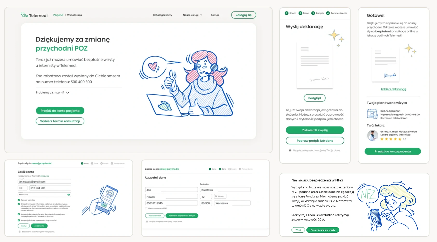
Enrolling meant a legally binding declaration, assignment to a physical "mother" clinic, and a national online signature — a long, mandatory process where any wrong turn lost a patient. My job was to make that path feel calm and obvious without skipping a legal step. I owned the UX/UI and feature prototyping, while the legal order sat with others.
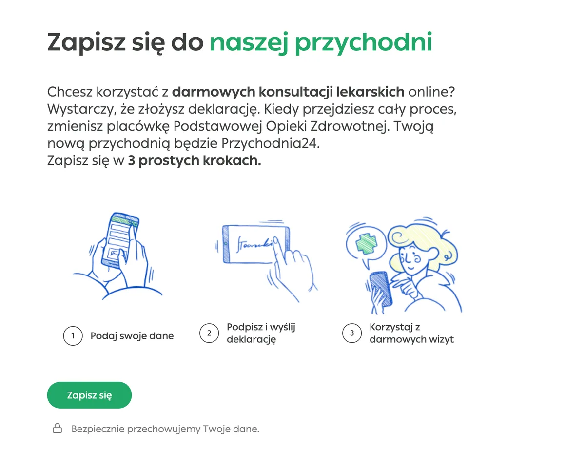
The steps were fixed, the feeling wasn't
This is the path a patient walks to enroll. I couldn't change the mandatory steps — so the design work was everything around them: how people are welcomed in, and how the strain of the bureaucracy is softened.
A warm way in
The flow opens on an information landing page — it tells the patient what they're choosing, prepares them for the formal steps ahead, and gives the journey one genuinely warm moment. This is where friendly illustration does the most work: I directed the page and the drawings it needed for a soft start, and an illustration artist drew them. People eased in this way finish more often than those dropped straight into the formal process.
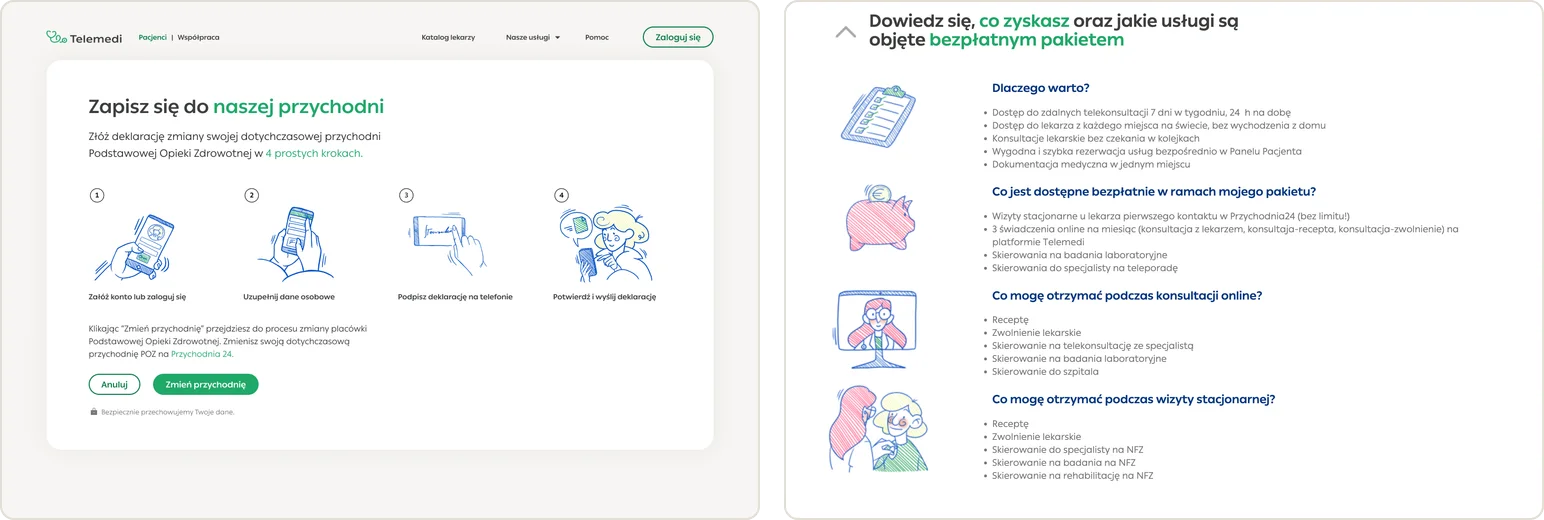
Make the rest kind
Where the law allowed, I had the paperwork handled automatically in the background, off the patient's shoulders. What had to stay, I made clear and light: the forms, the choice, the binding "Profil Zaufany" signature. My job was to make the required steps lighter, and understandable for anyone.
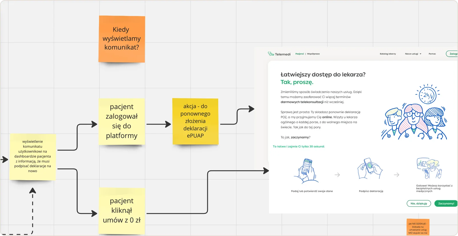
Tracked, not guessed
I couldn't legally shorten the path — so I tuned it. Retention was tracked on each mandatory step; the step that lost people got redesigned and re-measured, again and again.
Iterate — a flow I couldn't legally shorten, so I sharpened it.
Designed within the rules
Every screen answered to four hard rules: legal, clinical, and not all of them holding still.
Must have public coverage
Only patients with current public coverage could enroll — established early, clearly, without feeling like an interrogation.
A physical address, far away
Each patient was formally assigned to the Warsaw clinic even if they never set foot in it — made honest and understandable.
A moving legal target
The valid signing method shifted month to month before standardising on Profil zaufany. The flow had to absorb the change.
Information, not marketing
Polish law limits how care is promoted — so the work is clear, well-dressed information, not a conversion funnel.
For Telemedi, this was a rare chance to grow, and the enrollment was the one thing that could waste it, one drop-off at a time.
I worked as the sole designer on the flow, sitting between the legal and product teams who owned what the law demanded and what the platform could do. My role was the connective tissue — turning each mandatory, non-negotiable step into a screen a patient could actually move through without stalling.
It ran as a living flow, not a one-off project. Every release was prototyped, shipped, and watched: wherever people dropped, that step came back to my desk. Compliance was a fixed wall rather than a phase — so the work was less about big redesigns and more about steady, measured refinement.
A top-three online clinic in the national health system
The platform grew ~400% year on year while I was its designer — among Deloitte's fastest-growing in Europe.
The enrollment path every public patient signed up through.
Compliant — and genuinely understood — at national scale.